Golden cross and death cross: does it work after costs?
The 50-day average crosses the 200-day average. Courses say it starts a bull or bear market.
Too few trades to judge
Too few trades to judge
This rule fires rarely, so the sample is small. We found no edge, but a small one cannot be ruled out with this many trades.
Percentages are % of the amount risked per trade. New to R? Read this first.
The idea
The golden cross (50-day average above the 200-day) is taught as the start of a long uptrend, the death cross as the start of a long downtrend. It is one of the most quoted signals in financial media.
The rules we froze
These numbers are the usual textbook values. They were written before we saw a single result and were not changed afterwards.
Examples, good and bad
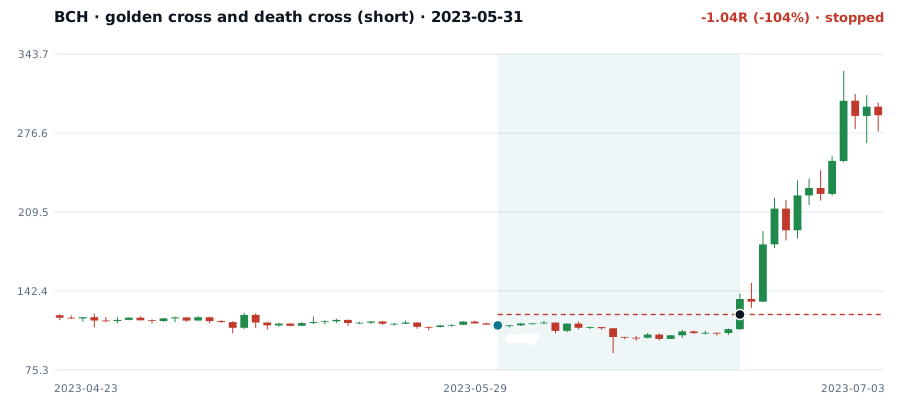
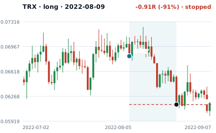
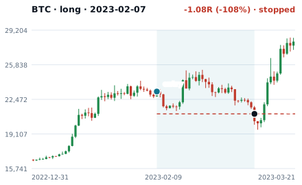
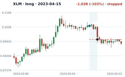
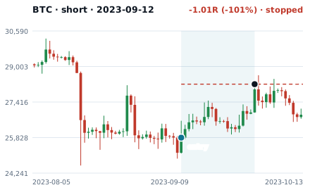
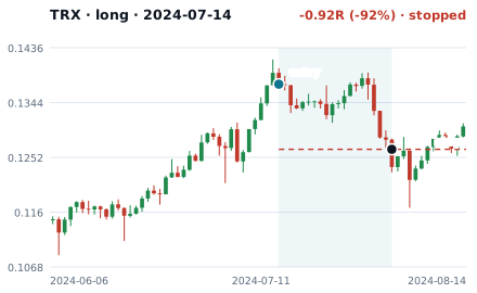
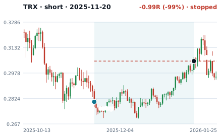
Two real trades picked by a fixed rule, not for being pretty, and six drawn at random from the held-back period (the most recent two years). 0 of the 6 won. Examples show the rule, they are not results: the results are the numbers further down.

Trade after trade
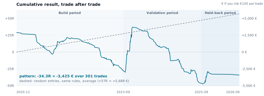
All 301 trades added up, with the three periods shaded. The right axis shows euros if you risked €100 on each trade. The dashed line is what random entries would have done.
By period
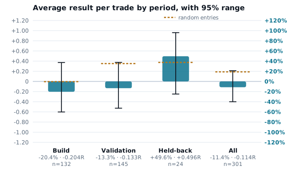
The same average, split by period. The black bars are the 95% range: if they cross zero, we cannot tell the result from luck.
By version
How the trades ended
Compared with entering at random
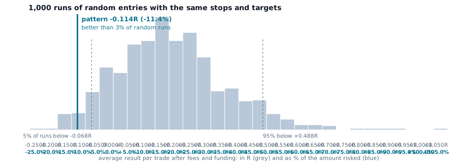
A pattern should beat luck, not zero. We ran 1,000 simulations that enter at random times on the same coins and periods, in the same direction, with the same stop distance, target and time limit.
Why the numbers look like this
Random entries lose too. Entering at random times with the same stops and targets averaged +18.9% per trade (+0.189R) because of fees, funding and spread. The pattern averaged -11.4% and did better than 3% of 1,000 random runs. That is the honest comparison: not zero, but what luck plus costs produce.
Before costs: -6.0%. After costs: -11.4%. Fees, funding and slippage took 5.4% of the amount risked from every trade, on average.
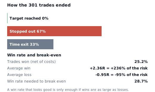
Win rate versus break-even. It won 25.2% of trades. With average wins of +2.357R and losses of -0.948R, it needed 28.7% to break even. The win rate is below what it needs.
Opposite side, same stops. Taking the opposite direction on every signal, with the same stop distance, averaged +7.4%. If the pattern carried real information, the pattern direction should beat its mirror by a clear margin. Here the gap is 18.8 percentage points.
Consistency across time. The average was positive in 1 of 3 periods. A real edge should not depend on which period you look at.
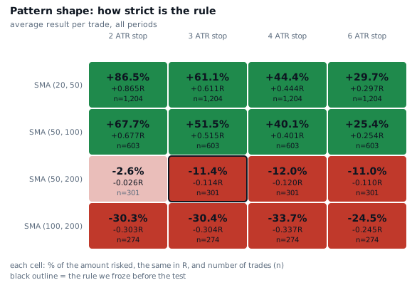
Sensitivity. Across 16 variations of the rule, 8 were positive and 8 negative. The best variation (+86.5%, 1,204 trades) is not a result: with 16 variations, a few green cells appear by chance. We look for a broad green region.
Does it survive changes?
Changing the pattern shape
Each cell is the same test with a different setting. The outlined cell is the rule we froze. Green is positive, red negative. We do not pick the best cell: we look for a broad region.
Changing the costs
Another timeframe
On 4-hour candles the same rule gave +3141929962.8% over 2,126 trades.
Coin by coin
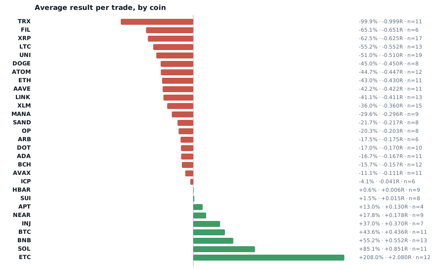
9 of 29 coins had a positive average. With a few dozen trades per coin, some are always positive by chance.
What this does not say
- It does not say golden cross and death cross never works. It says this version of the rule, applied to every case, shows too few trades to judge in this data.
- It is a simulation. Real fills, delays and emotions make results worse.
- The market may change. Results from the past are not a forecast.
- We publish tests of popular patterns, we do not publish or comment on strategies we use ourselves.
Method: how we test · Errors: corrections · Education only, not investment advice.
Questions about golden cross and death cross
Does golden cross and death cross work in crypto?
In our test of 301 trades on 29 crypto perpetuals, with real costs and funding, the average result was -0.114R per trade (-11.4% of the amount risked). Verdict: too few trades to judge. This applies to the textbook rule defined on this page, not to every way of using it.
Why do I see charts where golden cross and death cross worked?
Because any rule produces winning examples. A chart that shows a winner says nothing about how often the same rule fails. The test above applies the rule to every case, with costs, without picking.
What would make this result change?
A different timeframe or market, different exits, or filters that add information the pattern does not contain. We tested a second timeframe and 16 variations of the rule; the numbers are on this page.
How should I read the percentages?
They are percentages of the amount you risk per trade, not of your account or of the coin price. -11.4% means -11.4% of the amount risked, on average. See what is R.